Services
Analytics can be messy: endless requests, cluttered dashboards, frustrated users, and teams stretched thin.
I offer UX reviews, prototyping, and data visualization style guides to help teams design for understanding, reduce rework and dashboard churn, and align tools with real workflows and user needs.
-

Prototyping
Want to validate the design of your analytics product before committing to a full build?
I can create a series of low to high fidelity prototypes, allowing us to explore clarity, usability, accuracy, functionality, and more before committing to full build. This avoids costly rework, reduces uncertainty, and aligns technical and business teams earlier in the process.
-

Dashboard UX audits
If you have too many dashboards and too little insight into how they’re used (or if they’re used at all), I can help.
Through a combination of UX audits, stakeholder interviews, job shadowing, and analytics, I’ll identify what’s working, what isn’t, and where there are opportunities to consolidate, redesign, or sunset tools. The goal is to reduce noise, rebuild trust, and ensure your analytics outputs align with real decision-making needs.
-

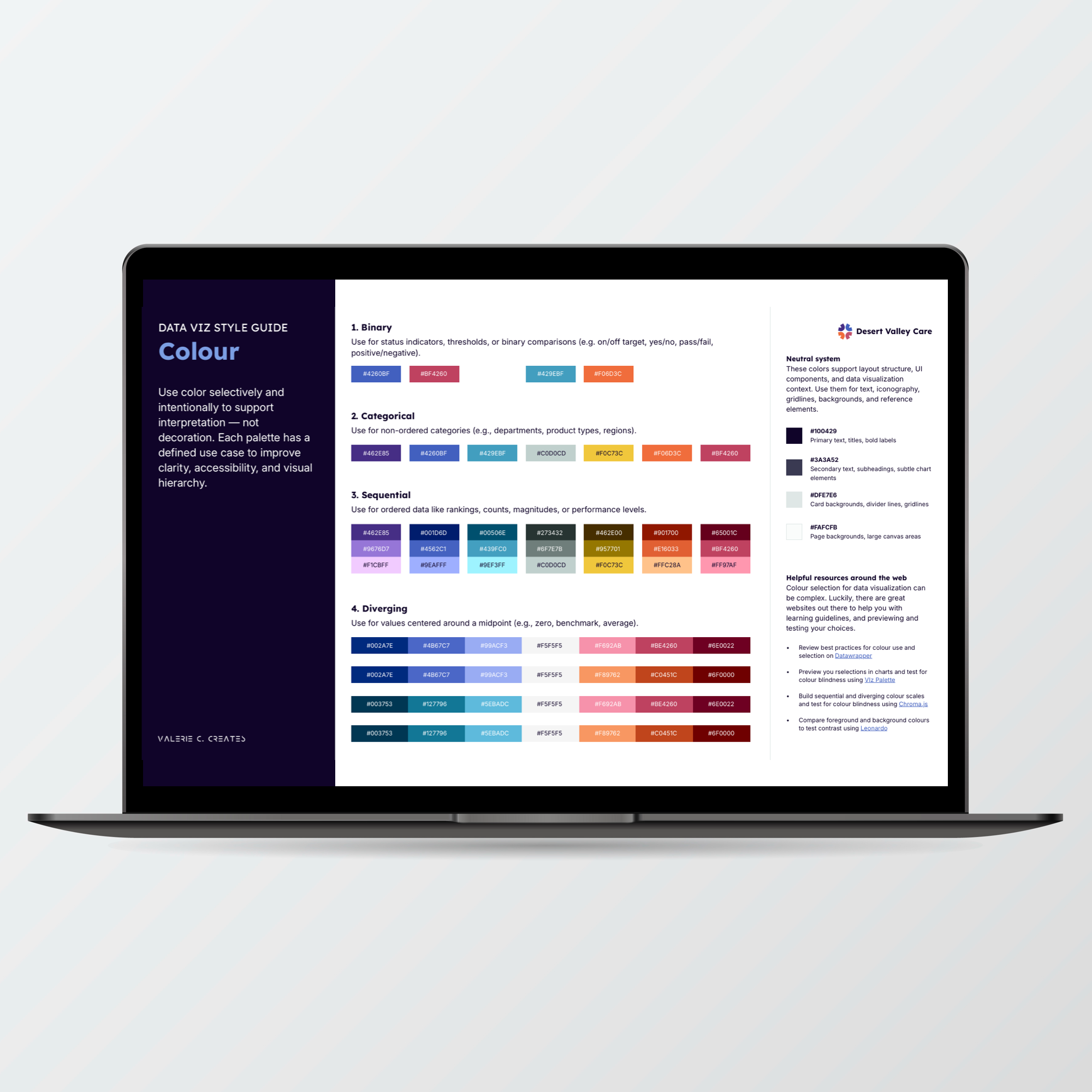
Data viz style guides
Do your analytics products have varying looks and feels, resulting in inconsistent user experiences?
I can create a style guide, which integrates corporate branding, interface design, and data visualization best practices to create a standard visual language for your analytics products. See below for an example.
-

General consultations
Curious about how to integrate design into analytics and BI work?
I offer advisory sessions to help your team think through design process, roles, management, supports, dependencies, and more. Design has been a missing role in analytics for far too long. Whether it’s sharing knowledge with interested staff, or creating space for a design-focused role, I’m happy to chat with you and your team.
What is a data viz style guide?
Data visualization style guides act as blueprints for analytics products — setting clear standards for color, typography, layout, navigation, iconography, chart types, and more. They help teams avoid reinventing the wheel on every project and ensure consistent, accessible, and user-friendly experiences grounded in best practices from data viz and interface design.
Contact me
Think we might be a fit? Let me know about your project and how I might be able to help, and I’ll be in touch with a time to connect!