Case study
Get a sense of my approach to analytics product design through a sample case study based in a healthcare context.

My typical approach to analytics product design
-

1. Ground in context
Informal interviews and job shadowing help me to understand the people and ecosystem the product will reside within. Some questions I’ll be curious about include: Who are the intended users? What are their roles and workflows? What are their pain points? Where are there opportunities for data and design to better support them?
-
2. Define + validate
I’ll outline my understanding of product design requirements, and validate it with the team for a shared understanding. What is the vision for the product? Who are the groups of users? What are the core tasks the product should support? What are the key measures, analyses, stratifications, etc.?
-

3. Design + test
I’ll combine product requirements, best practices in data viz and UI design, sample data, corporate branding to create a series of low to high fidelity prototypes, fuelled by feedback and testing with your team.
-

4. Hand-off + polish
From design specifications to Tableau templates, I’ll hand-off design work to developers in a way that suits their needs, and provide support with front-end polish where needed.
-
5. Launch + evolve
I’m here to support with launch planning, onboarding, communication material, feedback loops and lists, formal evaluations (e.g. surveys, usability testing), and more.
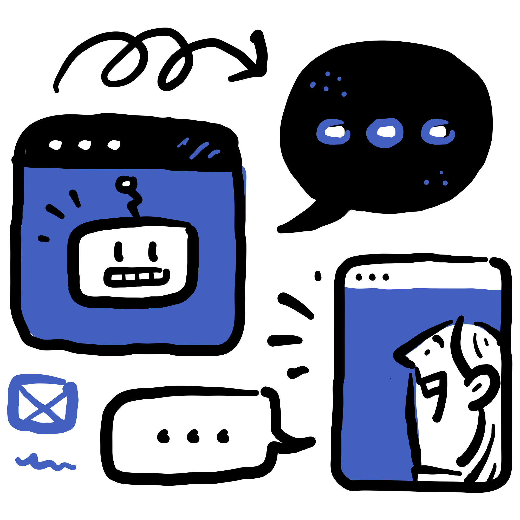
HOW I LEVERAGE AI IN MY PRACTICE
I use ChatGPT as a brainstorming partner during the early stages of projects. This includes planning UX research protocols and organizing design requirements. It helps with framing non-leading questions, and breaking down large or complex information into manageable chunks.
Overview
Mock client: Desert Valley Care — a mid-sized urban hospital with multiple clinical departments and a decentralized quality and safety team.
Core challenge: Patient safety reporting is fragmented, retrospective, and difficult to act on. Key data lives in delayed reports, spreadsheets, and siloed systems. This makes it hard for both clinical teams and leadership to identify patterns, respond quickly, or align on improvement efforts.
My role: Analytics product designer.
Tools: Sketch (for prototyping), Tableau (for testing visualizations with mock and/or real data).
Ground in context
To ensure product design would be grounded in real user needs and workflows, a solid understanding of the data, and aligned with organizational priorities, I began with a three-pronged research plan:
Stakeholders: Team meeting to understand product vision, organizational priorities, strategic use cases for the dashboard, target user groups, and key people to connect with.
Analytics team: Team meeting to understand roles, workflows, data availability and constraints, data definitions and nuances, and ideas for metrics and analyses.
Users: 1:1 interviews to understand roles, and job shadowing to understand workflows, information flows, workarounds, relationships to the data, pain points, and opportunities.
Define + validate: User profile
To design a meaningful analytics product, I need to understand how different user roles think, work, and make sense of information in context.
This information behavior–focused profile captures the realities of a Unit Quality & Safety Officer, a key role at the unit level. It maps their role, scenario, and how they seek, interpret, act on, and share safety data.
By grounding design in this context, I can minimize assumptions I have about the user, and align a product’s structure, visualizations, and interactivity to support real thought processes and workflows.
Define + validate: Information architecture (IA) diagram
While a full suite of analytics products would be needed to support all safety-related roles and goals across the hospital, this case study focuses on just one: the design of a dashboard to support unit-level safety monitoring and event exploration.
The IA diagram below maps the structure of this product. It clarifies the hierarchy of pages, and possible views and functionality. This can help drive alignment across users, stakeholders, and the analytics team, ensuring each page has a defined purpose, with available data, aligned with real needs.
Design + test: Annotated medium-fidelity prototype
For this case study, I designed two key dashboard pages with a focus on medication safety: one focused on KPI monitoring, another on safety event exploration.
While my design process began with low-fidelity sketches, I’m sharing a medium-fidelity prototype with placeholder data to illustrate layout, hierarchy, and core functionality. Annotations are included to guide interpretation and highlight key design decisions.


Next steps + considerations
The medium-fidelity prototype above intentionally opens the door to new conversations.
Based on current design decisions, user needs, and potential gaps, here are some of the questions I would use to guide collaborative iteration, research, and deeper data exploration.
"View KPIs" tab
What would be the impact of adding a distinct visual state to measures with no targets?
How are users understanding and using supporting context (e.g. Demographics, Systems Pressures)?
"Explore Events" tab
What would be the impact of adding trends over time or shift differences?
Would there be value in summarizing key insights for each level of severity?
How are users understanding and using heatmap–treemap interactions?
General considerations
How well do visualizations support users across varying levels of data literacy?
Where might users need support - and is that best solved through design or training?
Contact me
Think we might be a fit? Let me know about your project and how I might be able to help, and I’ll be in touch with a time to connect!